frussie.com
May 14, 2015 admin 0 Comments
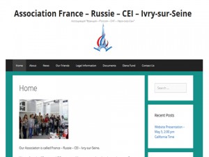
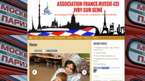
We created a website for a French – Russian association called France – Russia – CIS – Ivry-sur-Seine. It is in three languages: French, Russian and English.
The name of the website is frussie.com. That’s because in French France and Russia are France and Russie, so I merged them into frussie. This website looks good at any device (desktop, laptop or mobile device).
Why Ivry-sur-Seine?
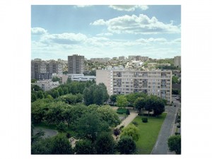
Ivry-sur-Seine is the south-eastern part of Paris, and it is traditionally a communist arrondissement. The French Communist Party was established here back in 1901. Here you can see a lot of buildings that were built by the Soviet Union – they look exactly as those in Moscow. I was inside those HLM (this is how this type of a building is called in France) – they look identical from the outside, but inside the apartments are much more spacious than those in Moscow.
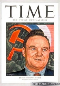
Ivry-sur-Seine was the first place I visited in France when I first came there (which was a long time ago). I met a lot of people from Ivry, and lots of them still have left views. Morice Thorez, who was the leader of the FCP for 34 years, was the deputy representative for Ivry.
The Association promotes linguistic and cultural exchange between the two countries: France and Russia. It does a huge variety of events: tours, exhibitions, trips and cultural conferences, publications, presentations of movies and shows, cultural visits and exchanges, etc. Their main activities are a Russian course taught to the French members in Paris and inviting Russian students to visit France.
All the pictures on the website are clickable – they are links to other pages or websites.
I translated all the content of the website from French to English and Russian,I sometimes had to create content in three languages from scratch.
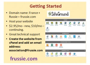
To create a website, we registered the domain name frussie.com and hosted the website at SiteGround.
The CMS we used was WordPress, it is a great platform that allowed us to avoid complicated coding, but we had to install a lot of plugins to add features to our websites. And we wanted our website to be responsive, i.e. display well at any device.
We tried 21 responsive themes, including GeneratePress and ExpressCurate.
We were first looking at the GeneratePress:
However, this theme has lots of limitations: we were not able to change colors, insert background images for the heading or the website as a whole, the margins in the container boxes were too big – finally, the footer contained those two links – Generate Press and WordPress – and we did not want them to be on our website.
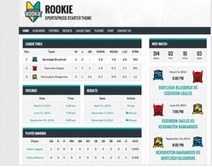
So, we chose a SportPress theme called Rookie:
This theme has all kinds of built-in sports features like display of matches, scores, teams, etc. – we disabled all of those, and we are very happy with our website design now as we were able to change colors, add background images, and our footer now looks exactly how we want it to:
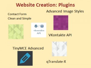
Finally, we installed lots of plugins:
To format images and pages/posts, we used TinyMCE Advanced for text and Advanced Image Styles for images, we also added Facebook buttons and connected our website to the Russian Facebook called VKontakte using its API, we used Master Slide, Google Search, Contact Form in three languages, Donate button and Google Maps to indicate the Association address. However, the most important plugin is qTranslate-X. It is a localization plugin that allows users to add as many languages to their website as they want.
My team (Marc (Lihui) Chen and Yunrong Gu)
Marc was responsible for uploading the News page in French, installing and testing plugins and also doing QA of the website, including testing it on various devices and in different browsers.
Yunrong did a great job creating the logo and background images for the website – she did all the DTP staff, and I am sure she will become a great web designer.
